
There is a growing tension in Ethereum’s market structure that is worth addressing directly. On-chain, the supply picture is arguably the most constructive it has been in a while. On the chart, however, ETH is still struggling to clear a resistance zone it has now tested four times in six weeks. The resolution of that tension, one way or the other, is likely coming soon.
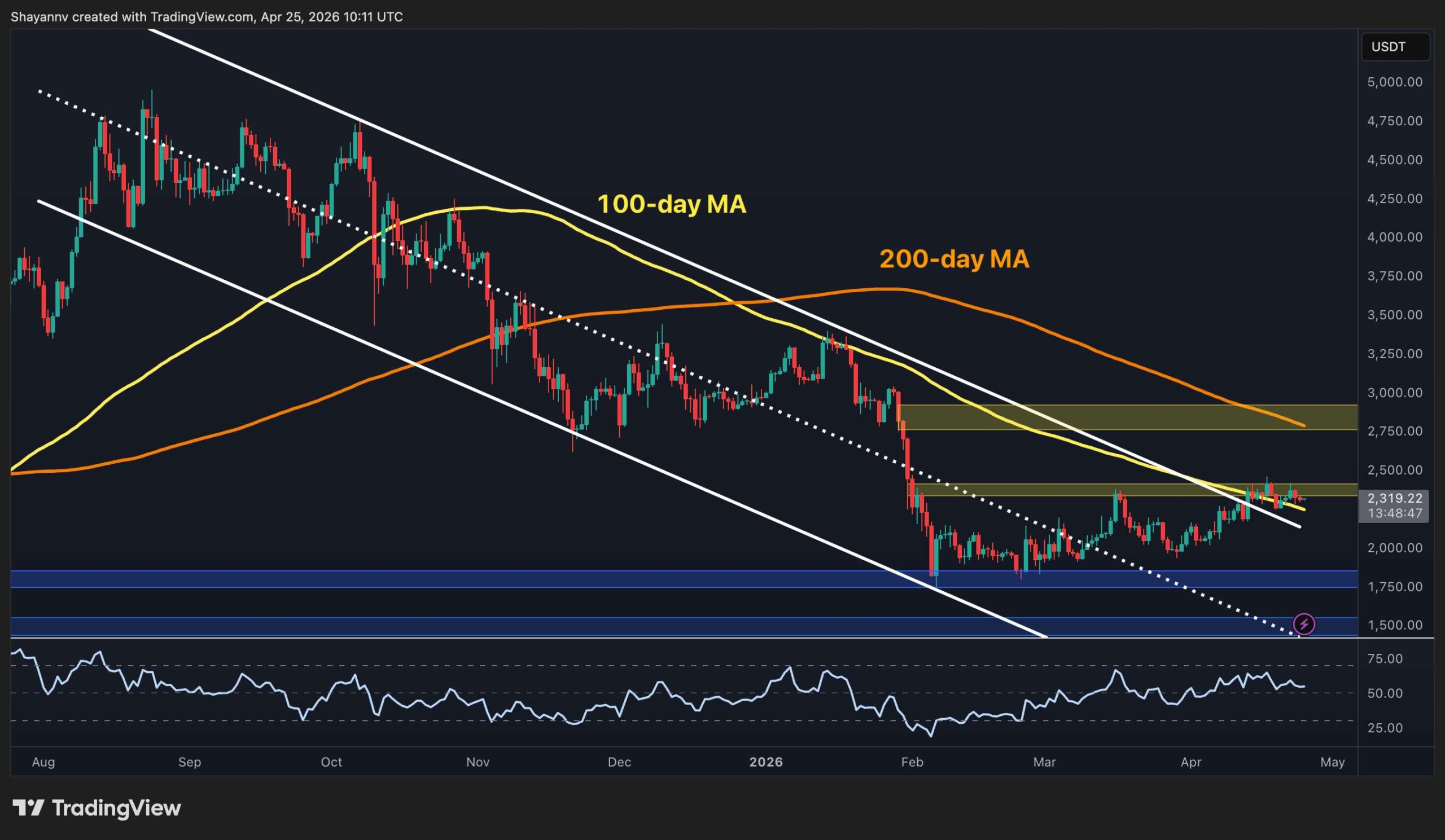
Ethereum Price Analysis: The Daily Chart
On the daily chart, the story is familiar. ETH is at $2.3k, the descending channel’s upper boundary has been broken, and the price is struggling with the 100-day MA, which is located just below the key $2.4k resistance zone. The 200-day MA (~$2.8k) sits as a distant but important ceiling above this area, and near the $2.8k supply zone.
What has quietly changed, though, is the RSI. It has been holding in the mid-to-high 50s for nearly two weeks now without the kind of sharp rollover that characterized the previous failed breakout attempt back in March.
This sustained momentum reading, modest as it is, suggests the selling pressure at this level is gradually being absorbed rather than immediately overwhelming buyers. Yet, the daily structure will not be confirmed as bullish until ETH closes above $2.4k and defends it on a retest.
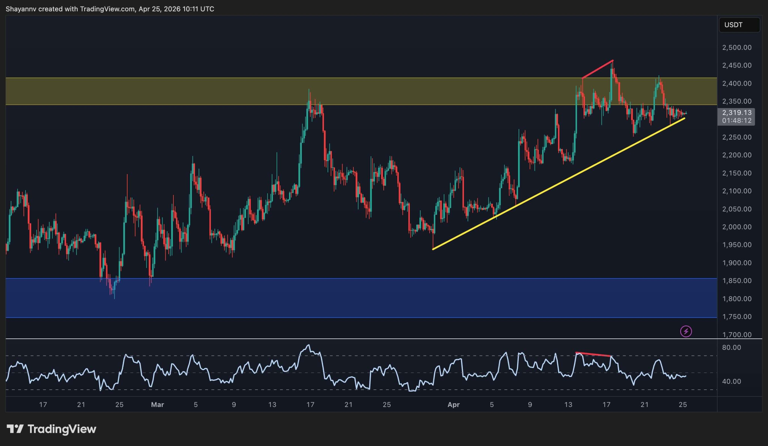
ETH/USDT 4-Hour Chart
The 4-hour chart shows a sharper ascending trendline that has been guiding price since the late-March lows, now providing support near $2.3k. ETH is sitting directly on that trendline at the moment, having pulled back from the recent rejections at $2.4k. These rejections were accompanied by a bearish RSI divergence visible on the chart, where the price made a marginally higher high while RSI printed lower.
That divergence has now largely played out with the pullback to the trendline, and the RSI has cooled to the low-to-mid 40s. The setup is a binary one, as holding the trendline here keeps the sequence of higher lows intact and sets up another attempt at $2.4k, while losing it on a close basis puts the $2k psychological support level in play. In case that level also fails, a rapid decline toward the $1.8k base would be highly probable.
On-Chain Analysis
The Ethereum Exchange Netflow chart tells an unexpectedly bullish story beneath the surface of choppy price action. Since late January, the dominant pattern has been persistent net outflows from exchanges. Red bars on the chart indicate more ETH leaving exchanges than entering, with only occasional brief spikes of inflows.
What is particularly striking is the acceleration in net outflows through April. Despite ETH failing to break above $2.4k, holders are continuing to withdraw ETH from exchanges at an elevated pace. This behavior points to conviction accumulation rather than opportunistic profit-taking.
Combined with exchange reserves at multi-year lows, the netflow data paints a picture of a market where the available supply for immediate sale is shrinking steadily, even as price has yet to reflect it. That kind of supply compression, historically, does not stay invisible to the price forever.

Prispevek Ethereum Price Prediction: Where Is ETH Headed if the $2.3K Support Cracks? appeared first on CryptoPotato.


Dodaj odgovor